
Basic Design Principles That Even Non-Designers Need To Know About
Basic graphic design for non-creatives. Learn simple tricks on colors, font, templates and how professionals make eye-catching visuals for all your little everyday projects.
You may think graphic design is daunting if you’re not a creative person by nature, but everyone can learn the basics and create visually appealing content for everyday requirements. Whether you’re creating a social media post or flyer for a local event, or crafting a presentation slide, these graphic design principles will get you started, and no art degree required!
Why Should You Learn the Basics of Graphic Design?
In the digital age in which we live, visuals count. A published good image can catch the eye and convey your article message clearly. For non-designers, learning a handful of design principles can help you save time and money by generating professional-looking graphics for personal or small business endeavors.
5 Simple Graphic Design Basics
1. Understand the Power of Color
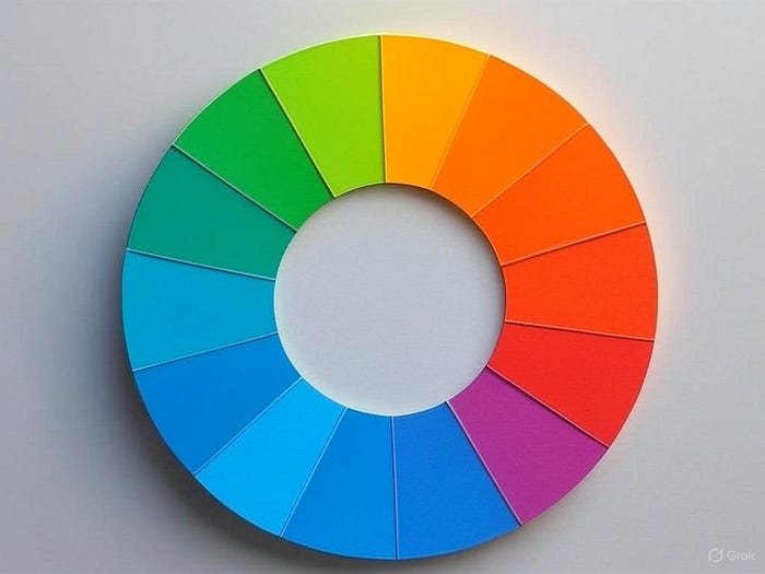
Colours convey emotions and create an ambiance. Limit your palette to 2–3 colors that go together:
Color wheel: The likes of Coolors or canva-based color palette generator offer attractive pairings.
Keep it simple: Try something like a bold color (blue) and a neutral (white or gray).
Pro tip: use high contrast colors to make sure text is legible (the ultralight color scheme uses black text on a white background).
2. Choose Readable Fonts
Fonts affect how one’s message will be received. For beginners:
Keep fonts to a minimum: One or two fonts maximum. If you use a bold font for headlines, consider using a more subtle one for body text.
Stick to the classics: Roboto, Open Sans, Lato: clean, can be adapted.
Cherish simplicity: Stay away from too many decorative fonts; it can appear chaotic.
3. Master Alignment and Spacing
Good design feels organized. Those of you who are not creatives can do this by:
Align elements: Utilize grids, or guides in tools like Canva to help keep text and images neat.
White space: Don’t try to fit everything in. Space allows your design to breathe and enhances how your text can be read.
Consistency: Keep text and images aligned consistently, such as left or center alignment.
4. Use Templates for Quick Wins
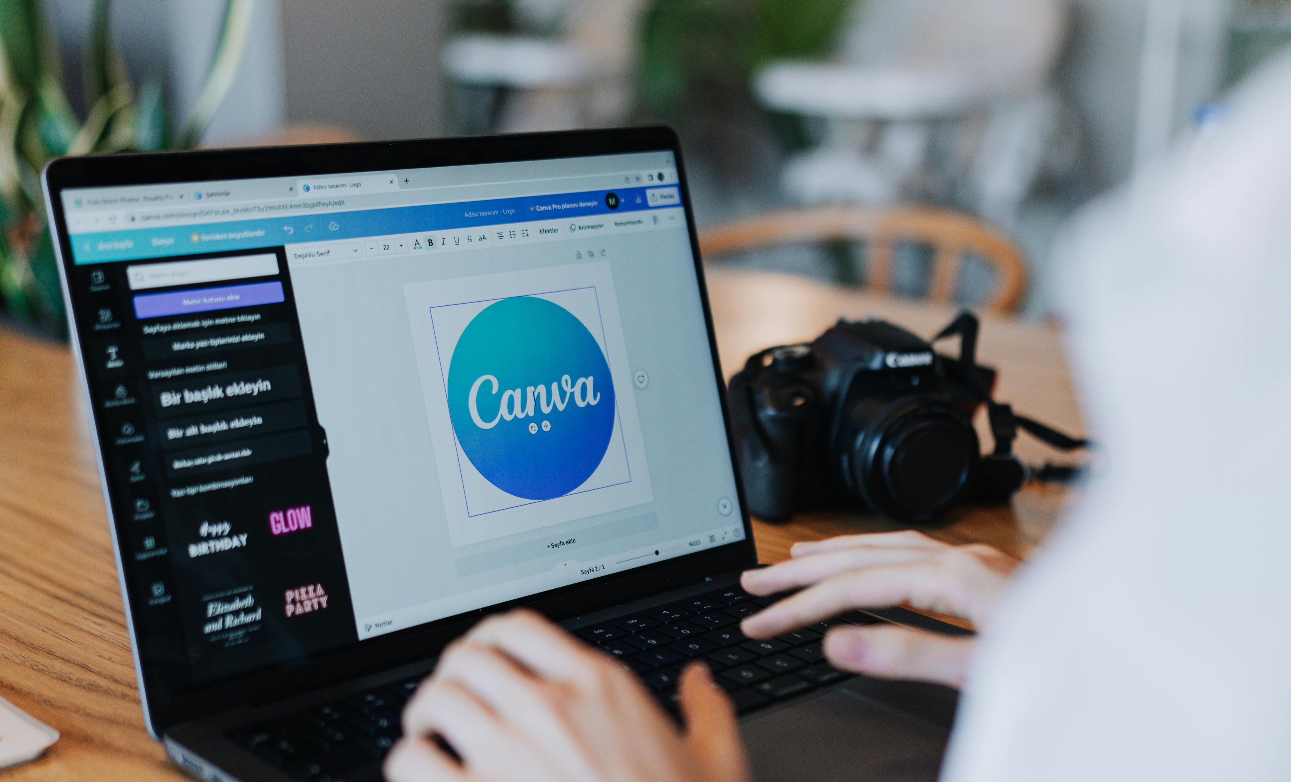
You don’t have to reinvent the wheel. Sites such as Canva, Crello, or Adobe Express feature simple templates for:
-
Social media graphics
-
Flyers and posters
Presentations Replace colors, fonts or images to fit your personal style while maintaining the professionalism of the design.
5. Keep It Simple
Less is more in design. Focus on:
Clear messaging: Getting your main point across with short, bold text.
Keep it simple: Don’t cram too many images and icons into your design.
Objective: Make sure that each and every component (image, text, or symbol) is contributing towards the purpose of your design.
Tools to Get Started
For non-creatives Complex software you don’t need. Here are some free or inexpensive tools to try:
Canva: Thousand of templates, drag and drop interface.
Crello: (VistaCreate) Like Canva, and good for fast designs.
Snappa: Easy tool for both social media and some basic graphics.
Google Slides: Free for building presentations with minimal design.
Practice Makes Progress
Start small with designing something you need, perhaps an Instagram story or a birthday invitation. Try one principle at a time: colors, fonts, alignment. You’ll learn to appreciate what looks good over time.
Final Thoughts
Graphic design doesn’t have to be intimidating. When you know to prioritise colour, font, alignment, utilise templates and the simple way, anyone can create quick visuals for every day needs. Give these basics a try now, and see the difference in your own designs!
Ready to start? Choose a free tool like Canva and design your first graphic today!